
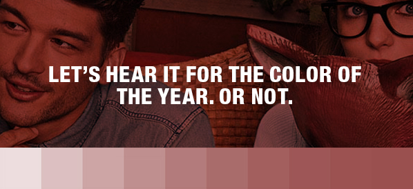
The color gods have spoken, at least those at Pantone.
In a press release issued in December, Pantone, the global color authority, announced PANTONE®18-1438 Marsala, “a naturally robust and earthy wine red,” as the Color of the Year for 2015. The announcement was met with a hue (literally) and cry from those who make their living by using colors.
The grandiose gesture of choosing one, highly specific color to represent the entire spectrum for the 365 days of 2015 begs an obvious question: “What criteria were used for this monumental decision?” Of course the folks at Pantone anticipated this pesky query. This is their story, and they’re sticking to it.
“The Color of the Year selection requires careful consideration and, to arrive at the selection, Pantone combs the world looking for color influences. This can include the fashion and entertainment industries – including films that are in production, the world of art, popular travel destinations and other socio-economic conditions. Influences may also stem from technology, the availability of new textures and effects that impact color, and even upcoming sports events that capture worldwide attention.”
According to Leatrice Eiseman, the executive director of the Pantone Color Institute, “Much like the fortified wine that gives Marsala its name, this tasteful hue embodies the satisfying richness of a fulfilling meal, while its grounding red-brown roots emanate a sophisticated, natural earthiness. This hearty, yet stylish tone is universally appealing and translates easily to fashion, beauty, industrial design, home furnishings and interiors.”
What Are We Supposed to Do With Marsala?
One would think something as important as the announcement of the “color of the year” would have graphic designers everywhere a-twitter with anticipation. Meh, not so much, at least around these parts.
The guys who design consumer packaging, websites, signage, collateral, television spots and print advertising at Prejean Creative were asked what they thought of Pantone 18-1438 and the response was reminiscent of a bad stand-up comic delivering lame jokes to the crowd at the Holiday Inn near the airport. Uncomfortable silence.
(Bam! Bam!) “Is this mike on? Is anybody out there?”
In the end, several conclusions were drawn about Marsala’s use for marketing purposes.
 Kevin Prejean had this to say about the color Marsala and its best use in graphic design.
“Marsala, she looks to be versatile. One day, she’s sophisticated enough to be comfortable in high-end, elegant design pieces. On other days, she’s casual and working in the garden. She’s comfortable mingling with similar earthy friends: blue-grays, OD greens, dark mustards, tans.
“Other than food branding or packaging, I’m not sure Marsala is a good fit for any long-term branding. She seems to be trendy and not appropriate for most companies’ permanent color palette. Of course, the title itself – Color of the Year – indicates temporary status.”
 Anyone who knows Gary LoBue Jr. knows he has an opinion about everything. Here are his musings about Marsala.
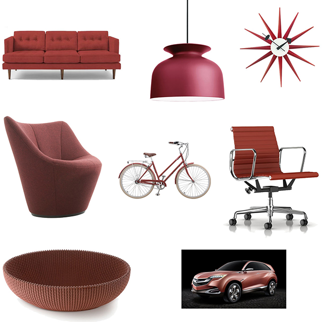
“This is a no-brainer. The best use of the color of Marsala in graphic design would be as follows: wine labels, wine bottles, wine steward clothing; vintner identities and logos, winery identities and logos, all associated collateral materials for wine, vintners or wineries; wine glass packaging and its associated materials; invitations for wine tasting events or parties; tablecloths, linens and napkins for residential or commercial use; annual reports, brochures and social media materials for vintners or wine manufacturers; collateral and promotional materials for automobiles such as Ferrari, Lamborghini, Maserati and Alfa Romeo, but not Fiat. Definitely not Fiat.”
How about consumer products and Marsala, Gary?
“Imagine the excitement that would be generated if these products leveraged the cachet of introducing Marsala-hued versions of their line: plastic clothespins; HP or Dell laptops (actually any cheap Windows-based product); any, and I mean any, kitchen appliance or kitchen accessory; ceramic planters, coffee mugs, men’s calf length socks and ink pens.”
 Brent Pelloquin is always a good resource for insights into color, even Marsala.
“I think it would really go well with veal. No, seriously, I think this color is an obvious choice for anyone in the wine industry. It’s a nice, rich color that makes me wish I was smelling wine and/or tasting wine. Perhaps a winery could produce a brochure that features their wine labels along with color swatches that indicate the varying shades of wine they produce. The swatches would obviously need to be scratch-n-sniff in nature, so prospective sippers can experience the aroma first hand. I think Marsala could find its proper place in a brochure like that.
“I also see this as a strong color for the women’s cosmetic industry. It’s a pretty fantastic color for promoting lipstick or nail polish. It definitely has a bold, yet sophisticated, feminine quality to it.
“It also has a nice, chocolatey element to it that could be utilized as an accent color in product packaging for high-end chocolates. Dark chocolate and Marsala look like they were made for each other.”
 The newest member of the graphic design team, Andre Dugal, had these observations about the Color of the Year. “It is such a specific color, and a working palette seems to be pretty limited with it. I guess Marsala is better suited for interior design and less for graphic design. It fits perfectly with the trendy, low-saturation rustic craze. And, with Pantone branching out more into physical products, it seems that’s the market they’re going for.
“Black is always the new black. We don’t need no stinkin’ Marsala when we got good ole’ fashioned black.”
What do you think of the choice of Marsala for the color of the year? Leave us a message below or comment on Prejean Creative’s Facebook page.
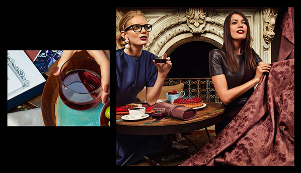
Fashionable Marsala photography courtesy of Pantone.
Thanks for a marvelous posting! I certainly enjoyed reading it, you will be a great author.I will ensure that I bookmark your blog and may
come back later on. I want to encourage that you continue your great writing, have a nice holiday weekend!