

One space or two? Every time you put two spaces between your sentences, a typographer sheds a tear.
The origin of the double space between sentences probably lies with the typewriter, which used monospaced fonts. This meant that every character was the same width. Those have been replaced by proportional fonts, in which different characters have different widths.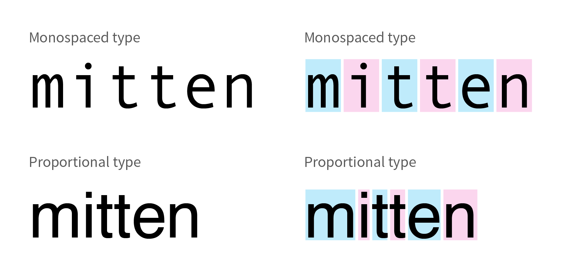
In the monospaced example above, a wide character (like “m”) takes up the same amount of space as a thin character (like “i”).
Monospaced type looks spread out and unbalanced, making it difficult to distinguish the separation between sentences. Adding an extra space was a logical way to make text more readable.
As PCs replaced typewriters, they abandoned monospaced type for proportional type. Not only is it more pleasing to the eye, but the characters are closer together, eliminating the need for the double space.
Chances are, if you learned to type on a typewriter, you add the extra space. Modern word processing makes this unnecessary. A double space is sooooo 1970s.