

Magical tricks with color. Amaze your friends.
You have a room to paint. You go to the paint store and pick an array of color options. Go home and tape them to the wall. You pick your favorite, buy the bucket o’ paint and apply it to the walls. You step back and have that “what the heck” (paraphrasing) moment. Something is off. The drapes look different, and so do the furnishings. It’s happened to most of us.
So, what went wrong? While there are many factors, one contributing factor to the dilemma is an effect called simultaneous contrast. It involves the way colors interact with each other when side by side. Simultaneous contrast can cause some amazing visual tricks with color.
How does this occur, you ask? When our eyes take in light, the retina processes it and an image is sent to the brain. Our eyes tend to seek a neutral balance in brightness, contrast and color. When it comes to colors, a neutral gray makes our eyes (and brain) the most comfortable. Our eyes are scanning, processing and manipulating light and colors to discern the imagery while striving to achieve this comfort zone. This results in interesting optical illusions.
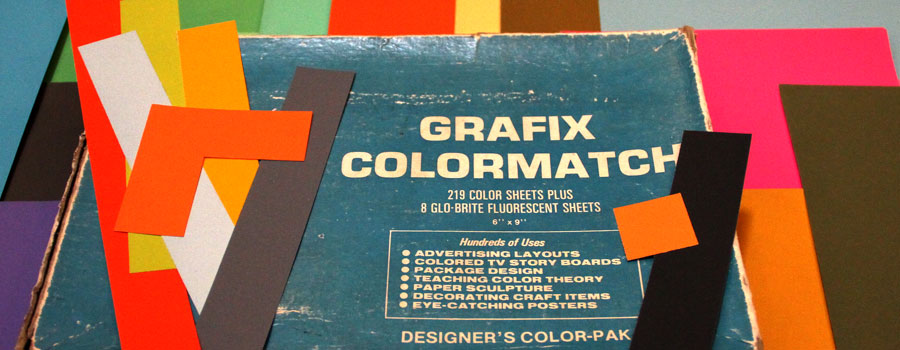
A favorite art design class I took at UL is based on color theory and a book by Josef Albers called Interaction of Color. A semester was spent studying and creating color optical illusions with color papers. I still have the box of Colormatch papers from school, pictured above. I was excited to learn that Mr. Albers’ book was converted into an interactive app in 2013. If you think you may enjoy experimenting with colors, I highly recommend it. Below are four examples from Albers that are the result of simultaneous contrast.
Now, good luck with picking those paint colors next go-round.
Making one-in-the-same color look like two different colors.
The two small squares look very different when juxtaposed with different colors. (hover or tap to pause animation)
Making two different colors look alike.
The two small squares look similar when, in fact, they are very different. (hover or tap to pause animation)
Special thanks to Michael Culpepper for the animation sequences.