Maintain Control of Your Brand. Create a Brand Standards Guide.


You worked long and hard to develop your brand and its visual identity. Now you need to protect those assets and ensure design consistency across all collateral created for your brand. What’s the best way to do that? Create a brand standards guide that states explicit rules for using brand elements. Ultimately, the guide becomes a roadmap that gives direction for visual branding without hindering creativity. It is especially important to share the guide with anyone – employees, vendors, advertising agencies, customers – using brand elements to create collateral and marketing materials.

Our art director, Gary LoBue, Jr., stresses the importance of a style guide, “Not having a standards guide would be like building a home without the blueprints. You’re merely guessing as to how to handle a critically important element’s color, size, spatial orientation or proportion in a variety of settings.”

Elements of a Brand Standards Manual
The content and length of a style guide vary by organizational needs. But, the basic elements of the guide are consistent. Every style guide should include:

Brand and/or mission statement – It is important that users of the guide know the brand. The mission statement, brand values or organizational philosophies help others understand the guiding principles of the brand, which should also guide their use of brand assets.

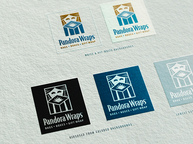
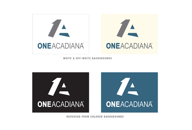
Logo Use – The logo is the key element to the brand identity. This detailed section of the style guide clearly shows different approved versions of the logo, as well as correct and incorrect treatment and uses of the logo.

Color Palette – Color is one of the most recognizable brand elements. This section of the guide gives very specific information regarding the brand’s color palette, including, both primary and secondary, and exact hex code, CMYK and Pantone colors for web, screen and print.

Typeface Guide – Fonts convey certain messages and ideas through their design and are therefore key elements in a brand identity. The details of the fonts and font families used by a brand need to be clearly identified.

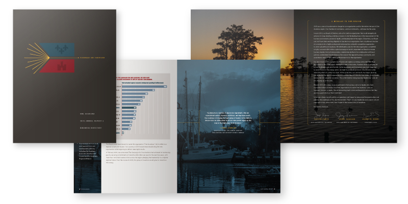
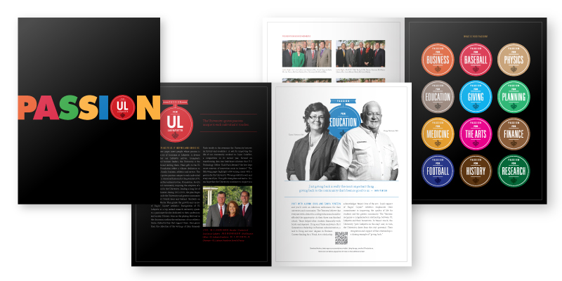
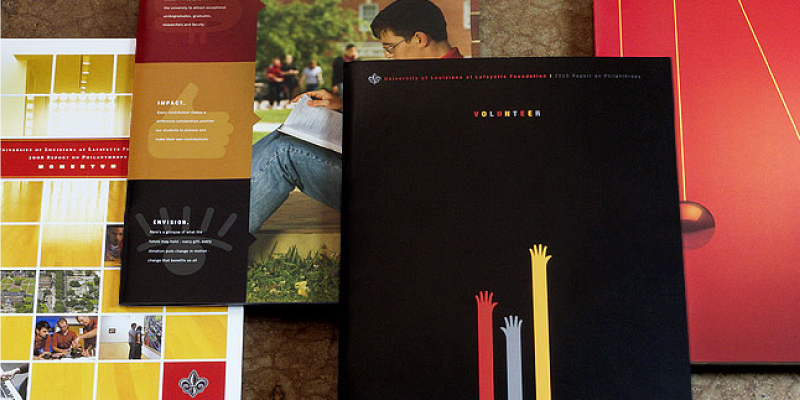
Imagery – The use of symbols, graphics, photography or any visual imagery should be clearly defined. Sometimes, imagery is more recognizable than words, making it crucial that any visual elements are recognizable brand assets.

Some organizations that have more complex structures go beyond the basics to include more details guiding the use of visual brand elements in marketing materials. Such sections could include:

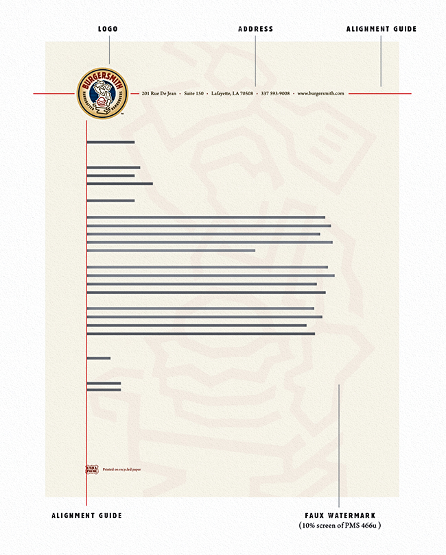
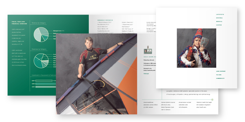
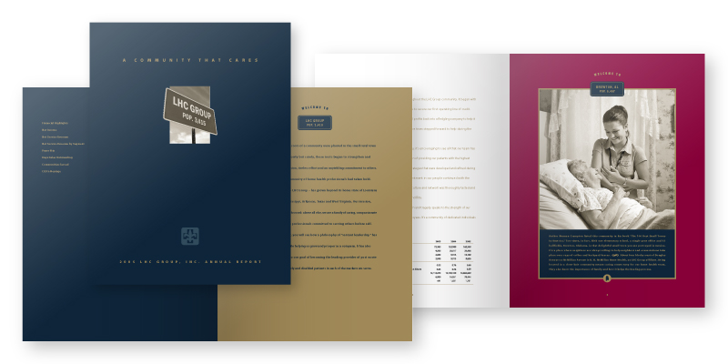
Template Designs – For organizations with multiple locations and vendors, it is prudent to include a section that specifies the layout of business templates, such as stationery, business cards, presentations, etc. The details should also include paper specifications for use with materials to be printed.

Social Media Policy – Maintaining control of anything on social media is extremely difficult, but this section of the guide establishes the framework for social media for an organization. It also dictates which platforms the brand will be active on, who has control of the accounts and the visual identity on each platform.

Signage Specifications – Provides users with business sign specifications to ensure that signs across multiple locations are visually consistent. Signage can be indoor or outdoor, and should cover a variety of possibilities, such as stand-alone buildings or shopping center locations. Keep regulatory requirements in mind when developing this section.

Merchandising Applications – Your brand doesn’t belong on everything. That’s why this section of the brand guide is beneficial. Use it to outline what types of products can be branded and how to use the brand elements on them.

Website Design – This section sets out instructions for anyone developing and posting content for an organization’s website(s). Hierarchy of elements and visual assets must be consistent across all pages of a website. This section serves as a guide for keeping a consistent design.

A Worthwhile Investment
No matter the size or the complexity of your organization, it is crucial to have a brand standards guide to ensure visual consistency across all collateral material. Your brand identity must be preserved and protected at all times, and an investment in a style guide is one that will not be wasted.


Posted in Branding | Leave a comment

It’s Oscar Time – the Prejean Creative Team Picks Our All-time Best Movie Posters

The 89th Academy Awards® ceremony is upon us and all eyes will soon be on Hollywood’s red carpet. The glitz, the glamour, the paparazzi – it’s almost palpable.

So what better way for us at Prejean Creative to get into the mood than to put on our tuxes, grab our tiaras and share the movie posters we believe raised the bar, pushed the art form or maybe even deserved that little golden guy.

May We Have the Envelope, Please!
Kevin Prejean’s Nominations:
From 1927, Fritz Lang’s Metropolis. An exquisite Art Deco and futurist masterpiece. Timeless.
Roman Polanski’s Rosemary’s Baby. From 1968, this poster exemplifies fear, loathing, psychosis and paranoia.
Otto Preminger’s 1959 classic Anatomy of a Murder. A Saul Bass masterwork of design and intrigue.
From 1979, Ridley Scott’s Alien. The hatching egg; the elegant type treatment; a sense of fear. In space, no one can hear you scream – a perfect visual execution of potential and kinetic horror.
Robert Altman’s 1970 anti-war comedy M*A*S*H. Very simple, a little bit odd, but truly a memorable image.

Lisa Prejean’s Picks:
From 1975, Steven Spielberg’s Jaws. While all seems normal above the water, something undetected and terrifying lurks just beneath the surface.
Joel Coen & Ethan Coen’s 1996 film Fargo. A cross-stitch of a murder scene; bizarre perfection for the Coen Brothers.
Mike Nichols’ 1967 groundbreaking The Graduate. An image just provocative enough to hint at the manipulation and temptations of the plot.
From 2016, Nate Parker’s The Birth of a Nation. Great symbolic imagery for a movie about a slave uprising.
2015’s The Hunger Games: Mockingjay – Part 2. The use of the black & white imagery with minimal touches of red is beautifully striking in this special IMAX edition poster.

Molly Metzger’s Selections:
From 2012, Quentin Tarantino’s Django Unchained. Capturing the theme of the movie perfectly, we see a graphic depiction of slavery, freedom and retribution.
Milos Forman’s Best Picture winner of 1984, Amadeus. The man… The music… The madness… an inspired and dramatic image based on the original Broadway poster.
Pixar’s animated entry from 2009, Up. A minimalist design that tugs at your imagination and hints at the adventure that is soon to follow.

Michael Culpepper’s Favorites:
From 1994, Disney’s The Lion King. With this poster, Disney regains its former glory and its animation crown.
The 1980 Irvin Kershner classic Star Wars: Episode V – The Empire Strikes Back. A long time ago in kids’ rooms far, far away, this was the poster every Star Wars fan had on his or her wall.
John Carpenter’s Big Trouble in Little China. From 1986, nothing captures this decade’s craziness like Kurt Russell, mullets, kung fu and air-brushed illustrations.

Gary LoBue Jr’s Nominees:
From 1996, Quentin Tarantino’s Pulp Fiction. A movie poster posing as a book cover, or is it vice versa? Brilliant.
Steven Spielberg’s 1993 Oscar winner Schindler’s List. It’s no accident that the list imprints over the inside wrists of the two individuals on the poster.
Steven Spielberg’s 1993 blockbuster Jurassic Park. A logo and tagline doing the heavy lifting. Simple. Memorable.
Bruce Brown’s 1966 documentary The Endless Summer. The poster that made a certain eight-year-old want to hitchhike to southern California.
From 1958, Alfred Hitchcock’s Vertigo. A dizzying display of typography, color and graphics. Another visual masterpiece by Saul Bass.

Bonnie McDonald’s Nominations:
From 2010, Tim Burton’s dreamy Alice in Wonderland. Colorful and full of the nuances you would expect from a place known as Wonderland.
Hollywood’s first blockbuster, 1939’s Gone With the Wind. The “As God is my witness, I’ll never love another poster again” poster.
William Friedkin’s 1973 genre-altering The Exorcist. The one light you want to stay away from, yet he has to go there. He has to go.
Tobe Hooper’s 1982 screamer Poltergeist. The simple, scary, white noise, little girl, “they’re here” in our TV, heebie-jeebies poster.
From 2012, the Joss Whedon-penned The Cabin in the Woods. The blood red / deathly black colors are eerie, and the copy line, too hilarious for a scary-movie lover like myself.

Cue the “Get Off the Stage” Music
We hope you found this Oscar edition blog informative and entertaining. Please comment by telling us about your all-time favorite movie posters.

Posted in Design, Fine Arts, Fun Stuff, Miscellaneous, Popular Culture | Tagged , , , | Leave a comment

A Press Release is Still a Relevant and Effective Promotions Tactic

For Immediate Release

Did you know the first press release was written by Ivy Lee in 1906? It was written in response to a Pennsylvania Railroad train crash that killed more than 50 people, and Mr. Lee had the company issue a statement about the tragedy, giving the company control of the story. This was seen as a revolutionary step in the way organizations communicated their stories to the public.

One-hundred-ten years later, the press release is still an effective tactic for companies to communicate to their publics, allowing them to control the stories that affect the brand.

Some would argue that in the age of digital and social media, the traditional press release has become irrelevant – that companies can release the same information through various social media channels and maintain control of the message by not having to put it into the hands of journalists. This is a very shortsighted view on the power of the press release. Used strategically, it is still a powerful part of an overall public relations/marketing campaign.

The Purpose of a Press Release
A press release is a tried-and-true tactic for getting a company’s news out to the public. Organizations use press releases to tell their brand stories in their own words. Issuing a press release allows you some control over the message by setting the tone and content, reducing the chances of erroneous reporting.

A release should be written to instantly grab a reporter’s attention, and entice him to follow up for more information with which to write the news article. A media outlet will only publish stories that are considered newsworthy. There are some common considerations the media use when deciding on covering a story:

  • Timing. A story must be current to be considered newsworthy.
  • Uniqueness. The more unusual or interesting the story, the more newsworthy.
  • Significance. A significant story is a newsworthy story.
  • Proximity. The closer a story is to home, the more impact it has and the more newsworthy it is.
  • Personal impact. Stories about people that evoke strong emotions are considered newsworthy.

One thing a press release should NEVER be is a sales pitch. Do not try to sell anything, and avoid marketing jargon and fluff. Telling a story with a positive tone is not the same as making a sales pitch. Focus on the story and what makes it unique.

The Distribution Channels for a Press Release
For a press release to be effective, it has to reach the intended audience. The advent of digital and social media has given organizations direct access to a larger audience, increasing the reach that stories can receive without going through the media. This reach has led some to believe that disseminating a release to traditional news media organizations, individual journalists or over wire services is no longer effective. This is flawed logic.

The proliferation of the self-publishing movement through social media is simply another distribution channel for the press release. While it is true that companies have a greater reach than ever before, a well-written press release that is covered by trusted media will extend the reach of the story to audiences the organization does not have access to. This reach is the underlying reason press releases are still very effective.

Traditional and modern distribution channels can, and should, be used in conjunction with each other to get the best reach for a story. To be successful through any channel, the release has to be picked up by the right audience. When sending to the media, direct the release to the individual reporter whose interests or beat align with the story. If sent to the wrong contact, the story is less likely to get picked up. Apply similar targeting tactics for social media channels – be sure to use the platform that best fits the purpose of the story, and has the audience that will have a direct interest.

Details of a Successful Press Release
The success of a press release hinges on the details. Most journalists will use a press release as a starting point for their own research for a story. However, some will publish a release as is, so it needs to be written like it is going to be published.

The beginning of the press release is the most important information of the story. It needs to hook the reader with a strong headline and encourage him to continue reading or follow up for more details to create a news article. Journalists look for well-organized releases that immediately cover the five Ws – who, what, when, where, why. Use this section to convince the reporter that he wants to run the story. When writing the release, keep in mind that if it is published as is, but must be shortened, the editor will most likely cut from the bottom.

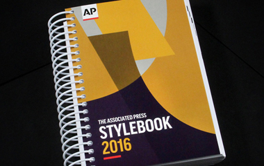
Important to a press release’s success is the writing style. All releases to the media must be written in The Associated Press (AP) Style. It is a very specific style of writing used by media, and there is a regularly updated stylebook that serves as a guide for anyone writing for the news.

Equally important to the writing style is the cleanliness of the copy. Successful press releases are free of any grammar, spelling or punctuation mistakes. Proofreading the release is the most important step in the development process, because if the release has errors of any kind, it risks rejection by reporters.

Visual and interactive elements accompanying a press release offer more engagement opportunities for readers, leading them to additional information beyond the release. Make the release more visual by including videos, infographics or interactive content when possible. Be sure to include links back to your website or social media accounts to encourage readers to learn more about the story or the company.

Adhering to a standard press release format improves clarity. Every release should have the same basic elements:

  • Contact information for the person within the organization to contact for more details.
  • A strong headline/title that succinctly expresses why the story is important.
  • The dateline that includes date, city and state.
  • The body of the press release with the story details.
  • The closing “###,” which signals to journalists the end of the story.
  • A brief description of the organization releasing the story, called the boilerplate.

An Opportunity to Tell a Story
A press release offers the perfect opportunity for you to tell a story or disseminate a message in your own words. Whether as a single announcement or as part of an overall marketing campaign, a well-written press release distributed to the right audience can have a strong impact. The evolution of digital media has added to the effectiveness of a press release by increasing the size of the potential audience. Taking both the traditional route through the media and the modern route directly to audiences through social media, organizations can maximize the reach of their story.

Posted in Earned Media, Media Relations, Promotions | Tagged , , | Leave a comment

Prejean Creative Tells You Why – Responsive Design

One Size Doesn’t Fit All…
Gone are the days of designing websites only for a desktop computer. Mobile devices, such as tablets and smart phones, have surpassed desktops as the preferred internet access point globally. Therefore, websites now have to be responsive to various screen sizes.

To illustrate, if viewing this page on a desktop, either adjust the window size or view this page on a mobile device. If you are viewing from a mobile device, view this page on a desktop. Keep an eye on the image. The difference is night and day.

…And Search Engines Have Responded
You may be thinking, “That’s neat and all, but my site analytics are good and conversions are still high. The user experience must not be too bad.” While this may be the case, search engines will recognize your site’s lack of responsive design. Since the recent widespread emergence of the mobile web, most major search engines have developed technologies to determine if a site is designed responsively. If it is determined unresponsive, its placement on major SERPs (search engine results pages) could be negatively affected.

Give Them What They Want
And by “them” we mean users and search engines. Users need a seamless experience no matter which type of device they are using, and search engines are seeking to deliver that experience. Make sure your website’s placement on major SERPs isn’t affected – invest in a mobile-friendly website. Developers and design teams can create a responsive site without changing the essential elements of your current website.


Posted in Digital Design, Mobile Marketing, PC Tells You Why, Technology, Web design | Tagged , | Leave a comment

The Art of Creating The Annual Report

annual_report_blog_header

The end of the year is a busy time for most organizations. While still focused on meeting customer needs, they also have to meet year-end obligations for the business, which may include producing an annual report. The annual report presents financial information about the performance of an organization, and is mandatory for any publicly traded company, though many private companies and nonprofits also produce them. The annual report is meant to be used as a performance assessment, but it can be more than just a regulatory compliance document. It presents the perfect opportunity for you to tell the story beyond the numbers, giving readers an inside look at your operation.

annual report

“We speak in every currency of the world” communicated the message of global growth for this annual report we designed for Western Union.

The annual report hasn’t always been seen as a marketing piece. Historically, it was simply a rather large, very dry document that touted the yearly financial performance of an organization. Over the years, it has transformed into something greater that connects to readers, and invites them into the story.

As the use of the annual report has evolved, so have the elements and trends for creating it. There is no single template for creating an annual report – each should be tailored to fit the needs of its own business or industry. But, there are some trends in the packaging and presentation of an annual report that will continue to shift the way it is received.

The Annual Report as a Work of Art
Take the time and make the investment to create an annual report that is both engaging and interesting to read. Make it a document that remains relevant beyond the publication date by injecting it with great storytelling that also speaks to the success of your organization.

annual_report_blog_ctrnonprofit

In this Center for Nonprofit Management annual report, we developed vivid imagery in the WPA poster style to frame the concept of working together for the good of all.

As art director Gary LoBue Jr. says, “The annual report allows a rare opportunity for a company to truly expand on their narrative. Every entity has an interesting story to tell, and that story is not always about the numbers. Give the readership some insight. Give them a story that will engage them.”

An annual report is the perfect place to have the company narrative marry its financial success story. A key part of storytelling is the concept, design and visuals that frame the words and numbers. Keep the door open for the use of an overarching concept that captures the tenor of your message, as well as color, graphics, images and any other design elements that will help transform your annual report to a work of art worth keeping and displaying.

Design for “Turners” and “Scrollers”
Annual report production is shifting towards electronic reports, in addition to traditional hard copy reports. The trend towards digital annual reports is strong, with 67 percent of public companies producing both a printed and electronic annual report. Plan for the future, but don’t abandon a print version if it still holds relevance for your audience.

This shift to digital reports pairs perfectly with the idea of the annual report as a creative marketing piece. One of the key advantages of the electronic format is the allowance for movement in the report. In general, digital content is better received when it includes video, images, infographics, animation – anything that is visually appealing.

Some companies choose to integrate digital assets into their hard copy annual report, bringing an added dimension of interactivity to the print version. In the UL Lafayette Foundation report, below, we included QR codes to direct readers to bonus content. In addition to (or instead of) merely reading the donor’s story, the viewer could see and hear the donor sharing his or her passion for the university, via video. Other QR codes linked readers directly to department or program pages where they could make a donation.

annual_report_blog_ul_passion


divider_H

With digital design also comes responsive design. Mobile devices have surpassed desktop machines as the preferred Internet access point worldwide – 51.3 percent to 48.7 percent. As more consumers use mobile devices, content has to be responsive to different size screens. A single-page responsive design is a common solution for the structure of an electronic report, as there is no flipping between pages. Users can simply scroll all the way through or use anchor text links to locate the information they are seeking.

The need for hard copy versus electronic, or both, varies significantly, depending on factors such as regulation and compliance, company size, industry, target audiences and many others. The decision to do one or both rests on your organization’s needs and your audience’s tolerance for change.

annual_report_blog_ul_group

We have used conceptual storytelling in a number of annual reports for the UL Lafayette Foundation over the years.

Key Elements of an Annual Report
Regardless of which presentation format you choose, there is an established standard for the type of information usually included:

  1. Successes – The end goal of an annual report is to tout the yearly accomplishments of a company. This can be done through both the financial review and the narrative. The successes should also include a “thank you” to those who made the achievements possible.
  2. Narrative – Tell your story. Invite the reader in with narrative that gives an inside look at what your organization really stands for.
  3. Executive Message – Most reports include a message from the CEO, or the highest ranking official within the organization. A company’s publics look to the leaders to provide a pathway to the future, as well as an analysis of the year’s performance.
  4. Financials – No annual report is complete without a look at the numbers. These can range from simple, engaging summary charts to comprehensive financial statements or a Form 10-K, depending on your organization.
  5. Call to Action – What should readers do with the information presented to them? Share it with others? Make an investment? Visit a website? While many will simply appreciate the yearly review, it’s a good idea to give the reader something more to do with the information.

While these elements are the backbone of the report, the only way to stand out in the crowd of annual reports is to use it as a platform that tells a story, and to give it a unique design that brings the information to life.

It’s All in the Details
Don’t resent or lament the task of creating your annual report. Instead, let it inspire you to put your best foot forward. Company leadership should take advantage of the annual report’s potential size and scope. Make it a trophy piece for marketing, highlighting your organization’s short- and long-term goals. This is a chance to build on the past year’s achievements, or to look past any challenges while focusing on the future.

Posted in Annual Reports, Design, Our Work | Tagged , , , | Leave a comment