There are a lot of challenges involved in the development of a simple printed collateral piece. When that piece is an annual report, the complexity of the process increases dramatically. A designer is challenged with the orchestration of a host of processes involving many people, services, details and late nights. A lot of layers and steps in the project means a lot of opportunities to alter the product, for better or worse. Any weak component in the process can negatively affect the final product. The stakes? Oh, just the perception and reputation of a company. No pressure, right?
Because it’s such a huge collaborative effort, good relationships are vital. The designer, the client, account representatives, writers, photographers, illustrators and others all have to play nice to ensure the success of the piece. A critical and often overlooked player in the game is the printer – or more correctly – the printing process. When the ink hits the paper. The final frontier, you might say.
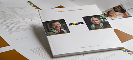
Actually, there’s quite a bit of collaboration with the printer prior to the job running on the press. And that’s what this here blog post is leading up to – the collaboration between designer and printer. To demonstrate, we’ll be using last year’s Western Union Annual Report as our model. The players: a client and an ad agency in Denver, Henry Gill Communications; Prejean Creative in Lafayette, Louisiana; and a printer, Sandy Alexander, in Clifton, New Jersey.

The first step is matching the project with the right printer. The complexity of the job, the budget and the overall size and scope of the project factor into the selection. Well, in this particular case, forget all that, because the printer was predetermined by the client, Western Union. And who are we to argue with a global Fortune 500 company? Fortunately, it was with a well-respected printer in New Jersey – Sandy Alexander. A great facility with an experienced, accommodating staff and a reputation for high-quality, large-scale work. So we’ve got that going for us – which is nice.
A little background on the annual report. It was divided into two parts – the themed narrative and the financials. We were assigned with the concept and design of the cover wrap and themed section – a total of 14 pages. The title of the annual report was “We speak in every currency of the world.” The stategy was to communicate the connecting of people and small businesses on a global landscape. The message also allowed us to work in the graphics from Western Union’s ongoing “Yes” campaign. We were also required to use photography from the “Yes” campaign and fill any holes with stock images. The message was written in the form of a letter from the President and CEO and flowed across nine pages. Bar graphs were added to illustrate the financial highlights.

Now back to the printing process. We were assigned a great print rep from Sandy Alexander, Chris Raum. A sharp and, thankfully, patient guy who knows the business well. We really needed that level of expertise because phases of the production weren’t exactly going smoothly. There were an inordinate number of changes to imagery and copy going well beyond the set deadlines. This situation was stealing days allocated for pre-press production, printing and binding.
The list of printer related tasks for this annual report:
• Bid the job
• Printer provides paper samples and blank “dummy” mock-up
• Ink samples or “draw downs”
• Sample screens for background graphics
• Several rounds of photography proofs (printed samples to replicate the final printed product)
• Final composite proof
• On-site press check
Bidding the job is pretty self explanatory. We selected different paper stocks for the two sections, and a bound mock-up was provided based on the anticipated page count.
The chosen design calls for six inks and two varnishes – the four process colors (cyan, magenta, yellow, black or CMYK), plus a brown and a gray Pantone match ink, plus a dull and a gloss varnish. The gray ink is for the text througout the report and the brown for large solids on several pages. Ink draw downs, or samples, of the gray and brown were shipped to us and Denver for color approval.

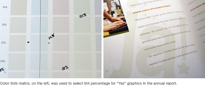
A more critical color concern was a set of pastel colors (tints made up from CMYK combinations) assigned to the multi-lingual “Yes” graphics. What you see on the computer monitor can be quite different from the printed product. They had to be dark enough to be visible in the background but also light enough for the text to print over them. Also, they needed to match each other in value from spread to spread. We set up a matrix of color squares with various percentages of color and had Sandy Alexander provide a proof. The chosen screen combinations were then applied to the computer art files.

We scheduled two weeks to do color correcting and proofing for the photo images. After sizing and cropping the digital photo imagery, we uploaded them to the printer’s server. They sent back color proofs or prints that replicate their presses’ output as closely as possible. We marked up the proofs with our changes, i.e. push the contrast, too yellow, sharpen here, remove blemish, etc. Ideally, we’d have at least three rounds of back-and-forth, but delays in photo selection approval cut the number of rounds.
Another hurdle was the fact that the imagery was not from a single source. Some was from Western Union’s library of stock imagery and some was selected from various stock photo houses. The range in quality was, for lack of a better word, unfortunate. We saw two rounds of color, leaving any final adjustments to be made when we get to New Jersey for the press check.
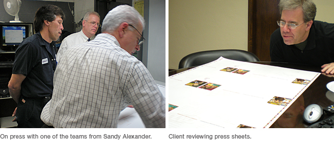
The morning I arrive at the printer is spent making final color corrections, and implementing several very last-minute changes to copy and, yes, a last-minute photo change. That afternoon the client representative and I proof the final composite. I head back to the hotel while the printer burns the plates and prepares for the first run.

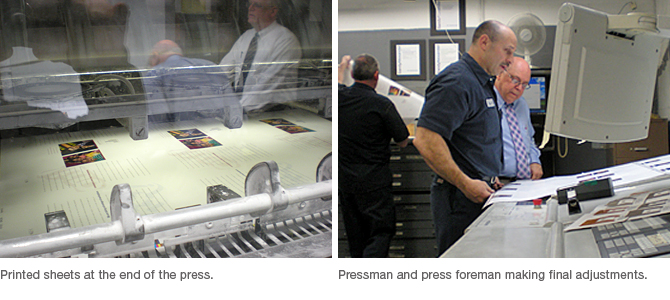
The first press run takes place near midnight, woohoo! We’re finally going to put some ink on paper. It will take five different press runs to complete the job. We are on two, monster-sized eight-color presses that run our six color inks and two varnishes in one pass. I’m working with my print rep, a press foreman and a pressman to bring this report to life. It’s a preliminary press run to get the job to our satisfaction. We sign off on a sheet and get out of the pressman’s way and he assures the entire run matches the approved sheet. We’re there to put a sharp eyeball on the press sheets, check the color, check for blemishes, and the registration of the dots. We’re not looking at matching the composite proof as the goal, but more like the starting point. It’s our last opportunity to push the colors one more notch. All the press runs are important, but the first one is critical and sets the standard for the other runs.

The remaining runs all take place the next day. Pages that end up side-by-side in the final book aren’t matched up that way on the press sheet. So we have to match the colors from different press runs very carefully. We finish the last run late that night.

Our job is done. The printed sheets then go to bindery to be sliced up and bound with the financial pages. In spite of the hectic, deadline-driven pace, the job went very smoothly. Happy client means happy designer. Props to all the fine folks at Sandy Alexander. And no matter what those New Jersey folks try to tell you, they’re the ones with the funny accent, not me.

